
SPECTRUM WINS BEST OF HOUZZ AWARD FOR 2019
SPECTRUM WINS BEST OF HOUZZ AWARD FOR 2019
Spectrum Painting and Paper Hanging Awarded Best Of Houzz 2019
Awarded by Community of Over 40 Million Monthly Users, Annual BOH Badge Highlights Home Remodeling & Design Professionals with Top Ratings and Most Popular Home Designs
Spectrum Painting and Paper Hanging has won “Best Of Customer Service” on Houzz®, the leading platform for home renovation and design. The 30-year old painting contractor was chosen by the more than 40 million monthly unique users that comprise the Houzz community from among more than 2.1 million active home building, remodeling and design industry professionals.
The Best Of Houzz badge is awarded annually, in three categories: Design, Customer Service and Photography. Design awards honor professionals whose work was the most popular among the Houzz community. Customer Service honors are based on several factors, including a pro’s overall rating on Houzz and client reviews submitted in 2018. Architecture and interior design photographers whose images were most popular are recognized with the Photography award.
A “Best Of Houzz 2019” badge will appear on winners’ profiles as a sign of their commitment to excellence. These badges help homeowners identify popular and top-rated home professionals in every metro area on Houzz.
“Best of Houzz is a true badge of honor as it is awarded by our community of homeowners, those who are hiring design, remodeling and other home improvement professionals for their projects,” said Liza Hausman, vice president of Industry Marketing for Houzz. “We are excited to celebrate the 2019 winners chosen by our community as their favorites for home design and customer experience, and to highlight those winners on the Houzz website and app.”

Spectrum Painting Earns 2018 Angie’s List Super Service Award
Spectrum Painting Earns 2018 Angie’s List Super Service Award
Award reflects company’s consistently high level of customer service
Pompton Lakes, NJ– Spectrum Painting & Paper Hanging, LLC is proud to announce that it has earned the home service industry’s coveted Angie’s List Super Service Award (SSA). This award honors service professionals who have maintained exceptional service ratings and reviews on Angie’s List in 2018.
“Service pros that receive our Angie’s List Super Service Award represent the best in our network, who are consistently making great customer service their mission,” said Angie’s List Founder Angie Hicks. “These pros have provided exceptional service to our members and absolutely deserve recognition for the exemplary customer service they exhibited in the past year.”
Angie’s List Super Service Award 2018 winners have met strict eligibility requirements, which include maintaining an “A” rating in overall grade, recent grade and review period grade. The SSA winners must be in good standing with Angie’s List and undergo additional screening.
Spectrum Painting has been listed on Angie’s List since 2008. This is the seventh year in a row Spectrum Painting has received this honor.
Service company ratings are updated continually on Angie’s List as new, verified consumer reviews are submitted. Companies are graded on an A through F scale in multiple fields ranging from price to professionalism to punctuality.
For over two decades Angie’s List has been a trusted name for connecting consumers to top-rated service professionals. Angie’s List provides unique tools and support designed to improve the local service experience for both consumers and service professionals.
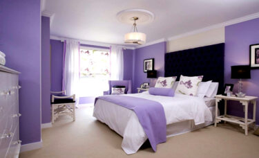
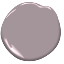
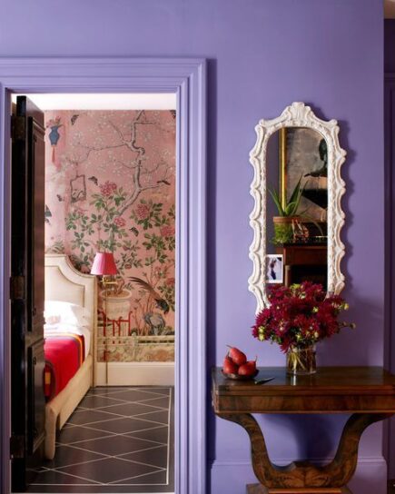
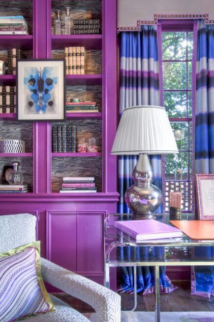
10 Purples You Should Decorate With!
10 Purples You Should Decorate With!
Purple’s one of those colors most people are only daring enough to try in small doses, and for good reason: It’s bold. You worry you might get sick of it after a while. But the color also gives a room personality. In a world of generic, Pinterest-perfect homes, purple stands out — in any shade. Scroll down, and you’ll become a believer. We’ll even ease you into it, starting out with paler, softer tones.
Then, once you’re rethinking every room in your house, you’ve got to check out these totally-not-babyish purple bedrooms for even more inspiration.
1. Amethyst: Try using Amethyst Sky 1447 Benjamin Moore
2. Mauve: Try using Iced Mauve 2115-50 Benjamin Moore
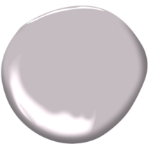
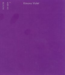
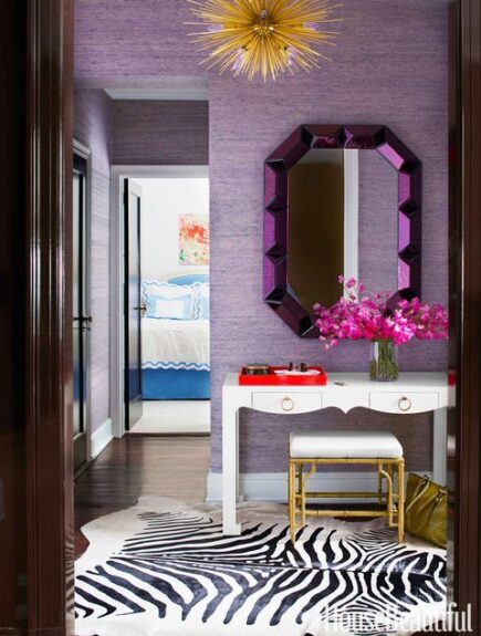
3. Bright Purple: Try using Kimono Violet SW6839
4. Wine: Try using Burgundy SW6300

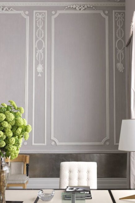
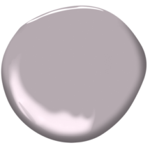
5. Purple-Gray: Try using Dusk to Dawn 1446 Benjamin Moore
6. Orchid: Try using Wild Orchid 2072-40 Benjamin Moore

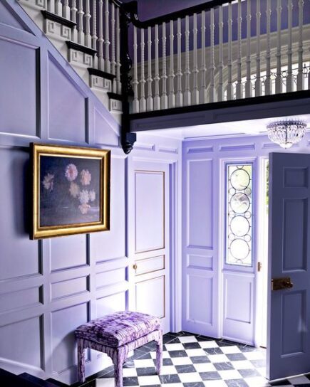
7. Violet: Try using Gentle Violet 2071-20 Benjamin Moore

8. Lilac: Try using Novel Lilac SW6836

9. Pinot Noir Purple: Try using Polished Mahogany SW2838

10. Fuchsia: Try using Forward Fuchsia SW6842

Tips on Preparing for Your Interior Project
Tips on Preparing for Your Interior Project
Painting multiple rooms in your home is a fun and exciting time, but it can definitely cause a few headaches and be a bit stressful. While the end result will be a home that feels more personal or updated, it can get frustrating to have painters in your home. Not to worry though, as Spectrum Painting is here to help make the process a little easier by prioritizing which rooms should be painted first.
With 30 years of experience, here is a prioritized list we’ve put together along the way:
- Bedroom and bathroom: Painting these two rooms first will get them out of the way and allow you to feel at home even if the rest of the house is still being prepped and painted. You will also be able to shut off your room from the paint smells, if any. Most paint is low to no VOC, so lingering smells shouldn’t be an issue.
- Kitchen: It is best to paint the kitchen as one of the first few rooms since this is where most families tend to congregate. Getting the kitchen done right in the beginning can cut down on going out to eat, as you’ll be able to stay home and cook!
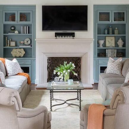
- Living/family room: This is likely one of the largest rooms in your home, so it might take longer; however, once it is finished, you will be able to move your furniture back and enjoy your freshly painted room.
- Laundry room/mudroom: Painting these rooms last usually works out as customers will sometimes store items, clothing, etc. in these areas while other rooms are being worked on. Also, many mud rooms are used at the main entrance and exit of homes, so you’ll be able to come and go as you please, whether it’s going to work, picking up the kids from school or heading out to pick up some donuts and coffee for your fantastic crew as a thank you!
Fun Fact: If part of your project includes refinishing your kitchen cabinets, Spectrum does suggest emptying them out before we begin prep so nothing becomes dusty, like food or your plates and mugs!
Customer service is our number one priority here at Spectrum Painting, so we will work with you to make sure we are tackling your painting project in the most convenient and efficient way. Give us a call today at 973-706-6033 to set up an estimate for your interior project! Check out our website to learn more about the many services we offer, including cabinet refinishing and concrete floor coatings!

Why Winter is a Great Time to Paint Home or Business Interiors
Why Winter is a Great Time to Paint Home or Business Interiors
Winter may not seem like the most ideal time to paint a home or business’s interior, but there are several advantages for the astute home or business owner. Below, we discuss several of winter interior painting’s upsides.
Good Spot on the Calendar…and Maybe Some Great Deals!
In spring, summer and fall months it can be hard to find a good spot on a painting contractor’s calendar. You might have to wait awhile to get that project completed that you really wanted done yesterday. In the winter, customers have better options. If a customer wants it done quickly, like in December, it’s quite a bit easier to schedule. If, however, you want to schedule for February, that’s easy, too. You also might run into some great deals in the winter that wouldn’t normally be available in the spring or summer for interior painting!
Faster Drying Times
The summer months are humid, especially in New Jersey. The Northeast’s winter months, however, are not. That means the winter air will dry your interior paint job more quickly than the air in the summer months.
Fortunately, most paints are very low-VOC and emit very little paint odors. Even though it might be cold, we’re still able to crack the windows or run an exhaust fan to help eliminate any odors and to speed up the drying process.
Projects Completed Faster
Yet another great upside to the winter interior paint job is that painters can do their work longer inside than they can when painting exteriors in the summer months. As long as you don’t mind the painters being around the home or business a bit longer as they complete the day’s work, your interior paint job will come to completion that much more quickly.
Great Lighting
Part of the beauty of painting in winter: The light is terrific. A sunny, snow-covered landscape casts wonderful light that illuminates almost an entire room, except for those little, dark corners. Even when there is no snow, very cold days are almost always clear and sun-filled. As for choosing colors, your best bet is to get color chips or even a little pint sample of paint and see how they look in a sun-drenched room during the day and how they look with lights on in the evening. A color will look different depending on the lighting.
Fortunately, most paints are very low-VOC and emit very little paint odors. Even though it might be cold, we’re still able to crack the windows or run an exhaust fan to help eliminate any odors and to speed up the drying process.
Do you have an interior project that you’d like completed this winter? Give Spectrum a call today at 973-706-6033 to schedule an estimate. We also offer color consultations to eliminate the stress of choosing colors! Did you know we offer other services besides painting, like cabinet refinishing, carpentry, handyman services and concrete floor coatings!
Cabinet Paint Color Trends to Try Today
Cabinet Paint Color Trends to Try Today
1. Bold Color Versus Muted
When it comes to cabinetry paint colors right now, anything goes! We love the bold and bright cabinet color trends featured in the magazines and on Pinterest lately, but will we still love those trendy bold hues in a year or two? You can have the best of both worlds when it comes to cabinet color — a fun color that you’ll love for years to come with an easy compromise.
A smart compromise is to consider choosing a muted color versus a bolder color. Muted colors have more gray and white in the undertone, which diffuses the intensity of the color pigmentation, giving the color more staying power because the color is less intense. Muted colors, like this bathroom vanity color painted in a beautiful green from Farrow and Ball called Green Blue #84 can be timeless. Other popular muted paint colors to consider are Benjamin Moore Smoke, Behr Tequila, Sherwin Williams Halcyon Green, and Benjamin Moore Aegean Teal.
2. Transitional Colors
Transitional colors are another way to compromise when comes to bold cabinet colors. Transitional colors feature a balance of warm and cool undertones, and because of that combination, these colors pair well with many others. Plus, these classic colors won’t go out of style.

For example, instead of choosing a cool blue paint color for your cabinets, consider a blue that has both warm and cool undertones in the color like Kentucky Haze from Benjamin Moore used on this butler’s pantry cabinetry. Benjamin Moore Moonshine, Sherwin Williams Rainwashed, Benjamin Moore Yarmouth Blue, and Behr English Channel are other popular transitional paint colors for cabinetry.
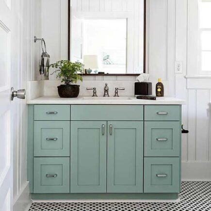
3. Gray Versus Greige
Gray continues to be one of the most popular trends right now in cabinet paint colors, but will it still be the big trend in the next two to four years? It’s impossible to predict how long gray is going to top the paint trend charts, so if you like the idea of a gray but want to make sure you choose a gray with staying power, consider a greige color (gray/beige combination). Greige colors also can be transitional colors that can work with a wider range of various colors and undertones throughout a space versus a limiting cool gray.
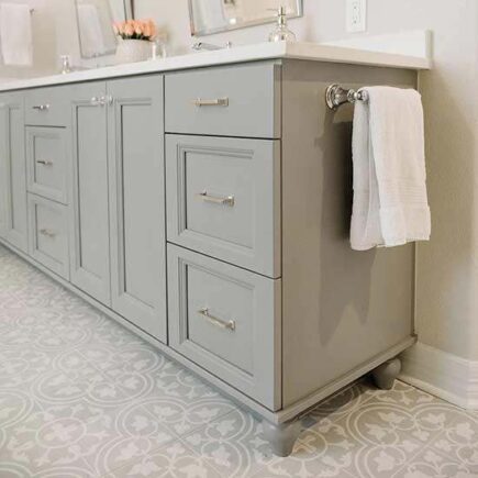
A beautiful greige color like Pratt and Lambert Ever Classic, used on this bathroom vanity from Erin at Image via Everyday Interior Design is a good compromise and will look stylish today and tomorrow. Other popular greige cabinet colors are Sherwin Williams Eider White, Sherwin Williams Repose Gray, and Benjamin Moore Kendall Charcoal.
4. Classic with a Twist
Classics like navy, black, and white always will be popular picks for cabinet paint colors. To add a twist to a classic, choose a color like a navy that has a hint of gray or purple in the undertone. This brings a richness and character to an otherwise traditional color and adds complexity and depth. It’s that rich depth that gives a color its staying power.

Hale Navy from Benjamin Moore used on the kitchen cabinets above is a great example of classic color with a twist. The rich gray undertone in the deep blue makes this color one of the most popular cabinet paint colors on the market today because of the interesting undertone combination. More popular classic cabinet colors with unique undertones to consider are Behr White Mink, Benjamin Moore Stunning, Benjamin Moore Evening Dove, and Benjamin Moore French Beret.
5. Bright White Versus Creamy White
White continues to be another popular cabinet paint color choice for designers and homeowners alike, and it’s one of the strongest trends in paint color right now. White is a classic and timeless color, but paint companies forecast the bright and cool whites popular today will warm up and trend toward creamier white.
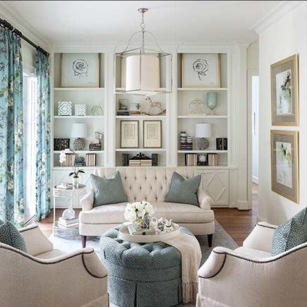
White with a hint of warmth like Alabaster by Sherwin Williams, used on the built-in cabinetry above, is a beautiful alternative to bright or cool white. Other popular timeless whites to consider for cabinetry are Benjamin Moore Decorator’s White or Benjamin Moore Simply White.
6. Make a Statement
Another easy way to make your cabinetry color stand out is to choose a color that will contrast the room’s wall color. The contrasting Kentucky Haze by Benjamin Moore on the cabinets above in this otherwise light space draws your eye and makes a beautiful statement. By keeping the wall color light in a space and choosing a rich cabinet color, the cabinet color will become the star of the show.
Spectrum Painting is able to brush or spray your cabinets, on site or in our spray booth, depending on your taste. We can also install new hardware if you decide not to keep the old set. Give us a call today to set up an appointment with an estimator and to discuss your options!
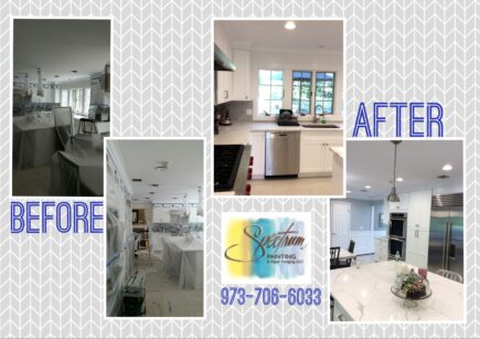
SPECTRUM PAINTING PROUD TO ANNOUNCE NEW CONCRETE COATING VENTURE
SPECTRUM PAINTING PROUD TO ANNOUNCE NEW CONCRETE COATING VENTURE

Spectrum Painting is excited to announce a new venture, concrete floor coatings! As northern New Jersey’s only certified installer of Penntek products, we are excited to offer a variety of exceptional floorcoating systems for your home or business.
Every flooring surface is a little different, and has its own set of unique needs and environmental conditions to consider. From a sun-drenched pool deck to a hard working garage, you need a flooring solution that offers a high level of performance in a cost-effective, low-maintenance package. We can help!
What are the benefits of a Penntek coating?

-4x Stronger Than Epoxy
-Cleaning Is a Snap
-Non-Slip Surface
-Will Not Crack or Chip
-1-Day Installation
-15-Year Warranty
-100% Antibacterial and Antimicrobial -Easy on the Feet!
Concrete Floor Coating by Spectrum Painting utilizes a proven floor coating system that can be customized to meet your needs and match your style. After thoroughly cleaning and preparing the surface, we follow these steps:
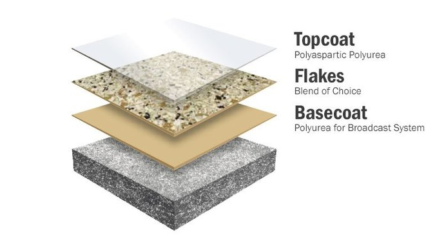
Step 1 – Preparation and repairs
Step 2 – Concrete reconstruction: pits and cracks are filled
Step 3 – Penntek’s 100% solids, self-priming, pure polyurea basecoat is mixed and applied
Step 4 – The chip is generously broadcast by hand
Step 5 – The floor is scraped and vacuumed to remove any loose or vertical-standing flake
Step 6 – The final step is to roll out the UV stable polyaspartic clear coat
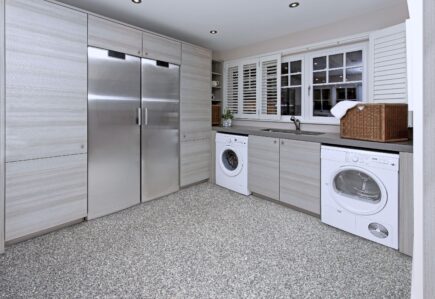
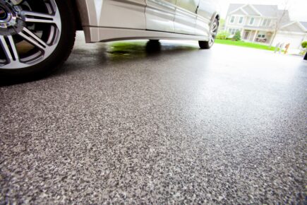
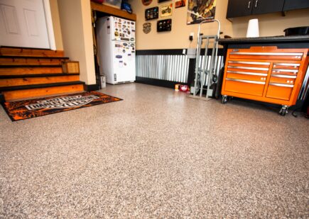
Spectrum Concrete Coating can be applied to garage floors, warehouses, laundry rooms, patios, retails areas, locker rooms, basements, kennels, restrooms and more! Give Spectrum a call today at 973-706-6033 to set up an appointment with an estimator. Click HERE to learn more about Spectrum Concrete Coatings!

ANNOUNCING THE COLORS OF YEAR 2019
ANNOUNCING THE COLORS OF YEAR 2019
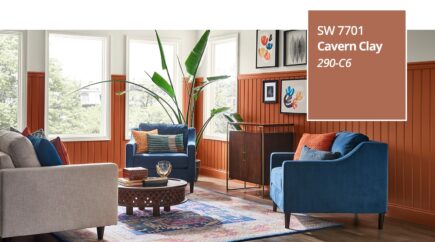
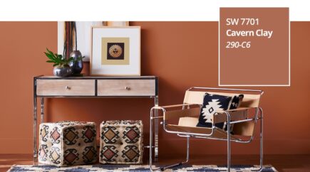
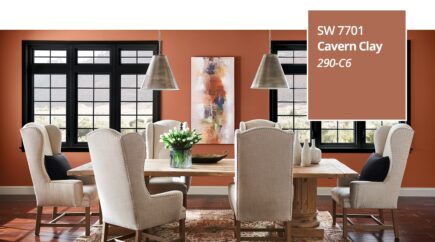
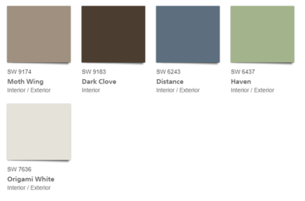
A warm terracotta color with ancient, elemental roots, Cavern Clay SW 7701, is our 2019 Color of the Year. Cavern Clay is a nod to midcentury modern style, but with the soul of the American Southwest, which together creates a desert modern aesthetic. This warm, earthy hue is both casual and refined. It can be the backdrop of a playful, welcoming dining room or kitchen when paired with bright tiles, warm stone and sculptural greenery. Complementary materials include leather, simple woodgrains and indigenous cacti in contemporary, sleek gardening planters. Cavern Clay is an easy way to bring the warmth of the outdoors in. Envision beaches, canyons and deserts, and sun-washed late summer afternoons—all of this embodied in one color.
Cavern Clay pairs well with other casual, balanced neutrals such as a warm gray or deep brown. Combined with Moth Wing SW 9174 or Dark Clove SW 9183, Cavern Clay evokes a carefree yet sophisticated aesthetic. Alternatively, consider a refreshed version of the popular ‘70s earth tone combinations by pairing Cavern Clay with a dusty denim blue, such as Distance SW 6243 or even a fresh avocado, such as Haven SW 6437. Even when paired with an Origami White SW 7636, Cavern Clay is decidedly fresh.
BENJAMIN MOORE- METROPOLITAN AF-690

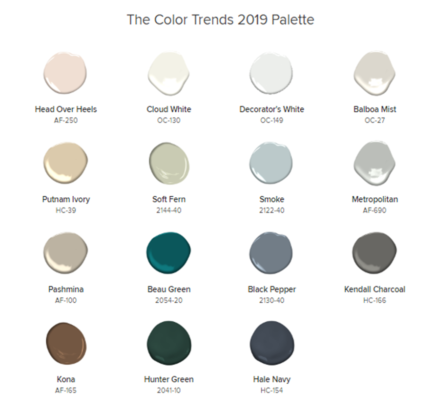
Calm, composed and effortlessly sophisticated, Benjamin Moore’s Color of the Year 2019, Metropolitan AF-690, exudes glamour, beauty and balance, while setting a neutral tone. This cool gray is meant to emphasize the calming role grays play in society. Metropolitan AF-690 is supported by Color Trends 2019, a coordinating palette of 15 harmonious hues.
See something you like and are interested in having your home painted? Give us a call today to set up an estimate and to inquire about our free color consultations! Get ready for the holidays and call us at 973-706-6033!
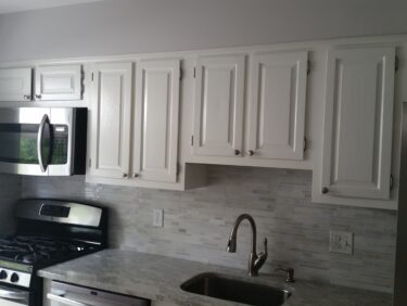
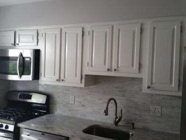
Refinishing Kitchen Cabinets
Refinishing Kitchen Cabinets
While the most expensive option if refacing your cabinets (changing out hardware and all the doors and cabinets with new ones or applying a laminate), the most effective option is refinishing. This can be achieved by either painting or staining the fronts and either cleaning and installing the previous hardware or upgrading. This option also offers your best return on investment.
Just as the painted wood work and doors in your home need periodic painting, so the kitchen cabinets will also need maintenance. An advantage to painted cabinets is that any nicks or worn areas can easily be touched-up, thereby extending the life of the paint job.
Cabinets in colors can be very exciting in the kitchen: in postal blue, light pastels, whisper gray and sunny yellow can all create surprising results. Decorating magazines often show cabinets in spruce green, Navy blue and weathered or faux finishes. Typically, we tend to see homeowners keeping with a clean white finish or a modern black color.
Small to medium kitchens can be completed in as little as three days, while larger kitchens can take upwards of five days or more. Spectrum Painting is able to offer either a brush or spray finish, depending on the job and customer preference. In terms of spraying, we are able to achieve this on site or in our shop, depending on the work space, etc. We have a portable spray system we are able to assemble in your garage or basement, or we can take all the cabinet fronts off and transport them to our shop, where we’re able to spray them.
Call Spectrum Painting today to set up an appointment and to discuss your options with one of our estimators. Also, feel free to check out our cabinet refinishing page or take a look at a previous article we did on awesome color combinations for your kitchen! Call us TODAY at 973-706-6033 for your estimate!
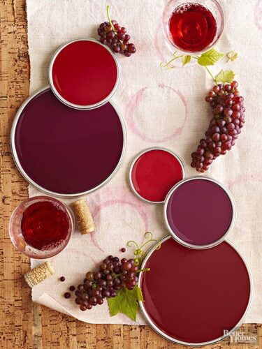
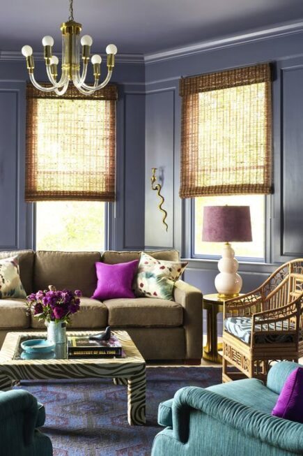
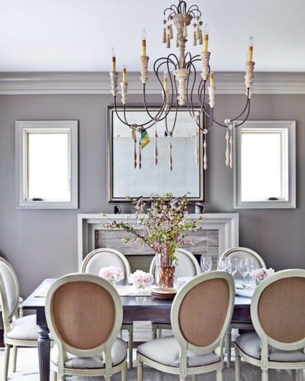
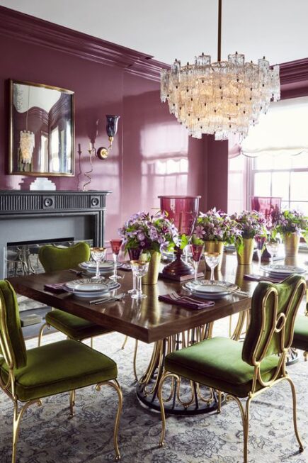
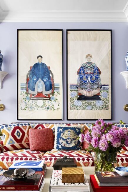
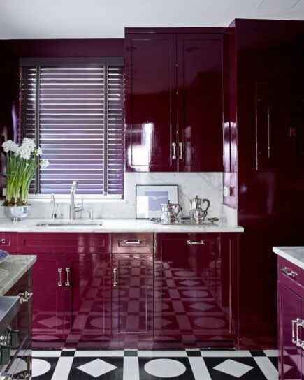
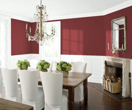
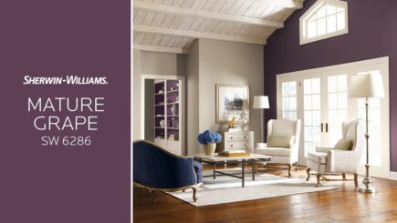
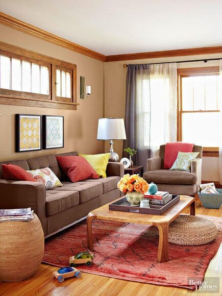
DECORATING WITH WINE COLORS
DECORATING WITH WINE COLORS
Full-Bodied Red: Cheery red wine-color walls act as an eye-catching gallery for a collection of prints. Keeping the wainscoting a simple white, similar to the pictures’ background, makes their subjects stand out.
Rich Purple: Looking for a new color to incorporate into your decor? Give grape-inspired purples a shot.
Wine Tasting: Rich brown tones layered throughout this room have a calming effect that’s nicely warmed with a few smart splashes of cabernet. The wine color shows up in a muted rug and a few pillows.
Champagne Dreams: On the lighter side, white wine colors such as chardonnay and champagne create a clean look with a gentle, warm glow in naturally lit spaces, such as this pretty kitchen. They’re effortless colors, even when used in large quantities, and mix well with pure white and classic cream to add subtle interest.

Are you interested in painting your home with a champagne or merlot pallet? Give us a call today at 973-706-6033 to set up an estimate and to learn more about our color consultations!